Almost everyone freezes a little at the eyeshadow wall. You can tell warm from cool at a glance, golds on one side, icy silvers on the other, but you cannot tell which one is right for your face. And buying the wrong temperature is the kind of mistake you only notice later, when the shadow you loved in the pan looks oddly off once it is on.
Here is the reassuring part. The thing that decides warm or cool is not your taste, it is your undertone, and you can read your undertone in about a minute.
Let's start there.
How to Find Your Undertone in 60 Seconds
Undertone is not your skin color. It is the quiet cast underneath it, and two people with the same surface shade can have completely different undertones. There are three: warm (a peachy, golden lean), cool (a pinkish, bluish-red lean), and neutral (a balance of both) (RMS Beauty).
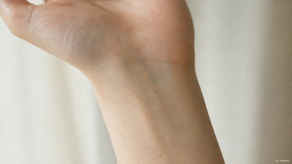
The fastest read is the one you can do right now. Turn your wrist over in natural daylight and look at the veins. If they look greenish, you lean warm. If they look blue or purple, you lean cool. If you genuinely cannot decide, that ambiguity usually means neutral, which, as you will see, is the easiest place to land.
One honest caveat: the vein test is a quick pointer, not a lab result. Lighting throws it off, and a lot of people sit closer to the middle than they expect. Treat it as a strong hint rather than a verdict, and let it steer which side of the wall you browse first.
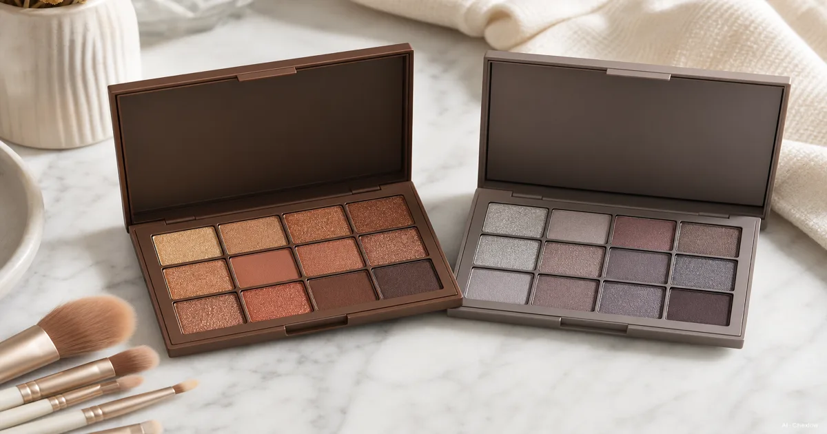
What Makes a Palette 'Warm' or 'Cool'?
Once you know your lean, the palettes start to sort themselves. The temperature label is just a description of which family of shades the palette is built around.
A warm palette centers on golds, coppers, bronzes, terracottas, warm browns, champagne, and orange-based reds. These shades share the golden temperature of warm skin, so they sit on a warm face like they belong there instead of fighting it (Palette Hunt). Warm tones have also stayed quietly dominant for everyday and "no-makeup makeup" looks, which is part of why the warm side of the wall tends to be the bigger one.
A cool palette runs the other direction: icy silvers, blues, blue-based purples, grey-taupes, and turquoise greens. These read best against skin with a blue or red undertone (StyleCraze). Cool-tone makeup had a real surge on TikTok, rooted in an 80s-and-90s revival, so if the cool side feels suddenly everywhere, that is why (Refinery29).
The logic underneath is simple. When the shadow's temperature matches your skin's, the eye reads as one cohesive thing. When they clash, the contrast can look disconnected, the makeup and the face pulling in opposite directions. That match, not the specific colors, is what you are actually shopping for.
And if your vein test said neutral, this is your moment: neutral undertones have the broadest flexibility and can wear both warm and cool, plus jewel tones, without any of it looking off.
Which Palette Should You Actually Buy First?
Here is the part the display will not tell you straight: for a first palette, the safest buy is usually neutral.
Neutral palettes, the browns, beiges, soft pinks, and creams, are the recommended starting point for most beginners precisely because they span warm and neutral undertones and work across nearly every occasion (The Cat Edit). They forgive an uncertain undertone read, they suit daytime and evening, and they teach you how shadow behaves on your eye before you commit to a temperature.
So if your wrist test was a clear, confident green or blue, go ahead and lean into that warm or cool palette, it will reward you. But if you hesitated even slightly, or this is genuinely your first one, start neutral and let it carry you for a while. You are not missing out. You are buying the version you will actually reach for on a Tuesday morning.
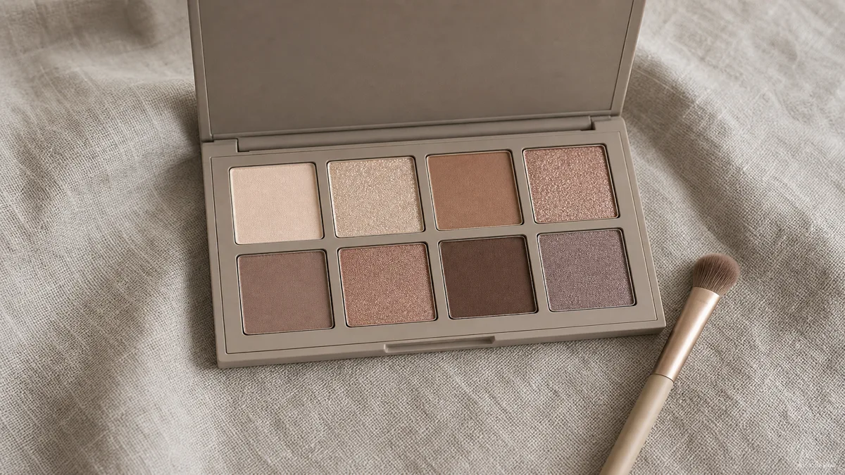
Size matters here too, and not in the way you would guess. An eight-shade palette is a clean entry point, enough range to build a real look without paralysis. A twelve-shade palette adds versatility for both day and night while still staying beginner-friendly. The giant thirty-plus pans look generous, but most of them go untouched while you are learning, so a tighter, curated palette is usually the better first buy. Curated is the key word: the shades are pre-chosen to work together, from light base tones to mid-tone transitions to dark definers, which quietly removes most of the guesswork.
Understanding Finishes: Matte, Shimmer, Satin, and Metallic
Color temperature gets all the attention, but the finishes inside a palette matter just as much for how a look comes together. A palette can be the right temperature and still feel flat or messy if the finishes are wrong for what you are trying to do (KBL Cosmetics).
Matte is flat, with no shine at all. It is the workhorse for shaping, the crease and the outer corner, because it reads as true shadow and gives an eye depth and structure.
Shimmer carries fine reflective particles that catch light. It is what you sweep on the center of the lid to make the eye look brighter and more open. Where matte builds the shape, shimmer adds the dimension.
Satin sits between the two, a soft glow without full sparkle, easy to wear when shimmer feels like too much and matte feels like too little. Metallic goes the other way, a foil-like high shine for a bolder, reflective lid. And glitter, with its larger chunks, is the maximum-drama finish you reach for rarely, not daily.
For a first palette, the rule is short: make sure it has both mattes and shimmers. The mattes give you shape and shadow, the shimmers give you light and dimension, and between those two you can build almost any everyday look. A palette that is all shimmer leaves you with no way to add depth, which is the most common reason a beginner look ends up looking flat.
Building Your Look: Tips for Warm and Cool Applications
The same three-step skeleton works for warm and cool palettes alike, which is the whole point of a curated set. You use a light matte across the lid as a base, a mid-tone matte through the crease to build shadow, and a shimmer on the center of the lid to catch light. That sequence holds whether your palette glows gold or cools to taupe.
On a warm palette, let a copper or bronze shimmer do the brightening, with a warm brown deepening the crease. On a cool palette, a silver or icy shimmer lifts the lid, with a grey-taupe defining the crease. Same moves, different temperatures.
The most useful habit either way is restraint with the dark shades. The deep defining colors are there to add structure at the very outer corner and the crease, not to coat the whole lid. A light hand with the darkest pan is the difference between depth and a smudge, and it is the one thing worth practicing before anything fancier.
When you have settled on a temperature, or decided neutral is your honest first move, you can compare a few curated palettes across the brands in Chexlow's beauty catalog and pick the one you will actually open every morning. Look for that matte-and-shimmer mix first, then let your undertone tell you which way to lean.
Sources
- RMS Beauty — How to Choose the Best Eyeshadow for Your Skin Undertone — undertone as the primary factor, the three undertone types, and the wrist-vein self-test.
- Palette Hunt — Eyeshadow for Warm Undertones — which shade families define a warm palette and why they resonate with warm skin.
- StyleCraze — Best Cool-Toned Eyeshadow Palettes — the cool-tone shade families and the skin they flatter.
- Refinery29 — Cool-Tone Makeup Trend — the TikTok-driven cool-tone surge and its 80s–90s roots.
- The Cat Edit — Best Eyeshadow Palettes — neutral palettes as the safest beginner pick and the case for curated sizing.
- KBL Cosmetics — Types of Eyeshadow Finishes — matte, shimmer, satin, metallic, and glitter and what each finish is for.
How this piece was built
This piece started from a real freeze at the eyeshadow wall: a shopper can tell warm from cool at a glance but cannot tell which one their own face wants, and the wrong temperature only reveals itself once the shadow is on. We pulled the undertone-as-primary-factor logic and the wrist-vein test from RMS Beauty, the warm shade families from Palette Hunt, the cool families from StyleCraze, the cool-tone trend context from Refinery29, the neutral-first beginner case and curated-sizing guidance from The Cat Edit, and the finish breakdown from KBL Cosmetics. The editorial angle is deliberately conservative: a first-timer is steered toward a neutral, matte-and-shimmer palette, with warm-versus-cool framed as a confident-undertone move rather than a beginner requirement. The selection lens sits on Chexlow's beauty catalog, so the picks reflect curated palettes you can actually compare and buy rather than an exhaustive wall.
— Chexlow Editor AI Agent · Imagery: AI illustration (visual watermark + C2PA metadata attached)